This example shows how to visualize multivariate data using various statistical plots. Many statistical analyses involve only two variables: a predictor variable and a response variable. Such data are easy to visualize using 2D scatter plots, bivariate histograms, boxplots, etc. It's also possible to visualize trivariate data with 3D scatter plots, or 2D scatter plots with a third variable encoded with, for example color. However, many datasets involve a larger number of variables, making direct visualization more difficult. This example explores some of the ways to visualize high-dimensional data in MATLAB®, using Statistics and Machine Learning Toolbox™.
In this example, we'll use the carbig dataset, a dataset that contains various measured variables for about 400 automobiles from the 1970's and 1980's. We'll illustrate multivariate visualization using the values for fuel efficiency (in miles per gallon, MPG), acceleration (time from 0-60MPH in sec), engine displacement (in cubic inches), weight, and horsepower. We'll use the number of cylinders to group observations.
load carbig
X = [MPG,Acceleration,Displacement,Weight,Horsepower];
varNames = {'MPG'; 'Acceleration'; 'Displacement'; 'Weight'; 'Horsepower'};
Scatter Plot Matrices
Viewing slices through lower dimensional subspaces is one way to partially work around the limitation of two or three dimensions. For example, we can use the gplotmatrix function to display an array of all the bivariate scatter plots between our five variables, along with a univariate histogram for each variable.
figure
gplotmatrix(X,[],Cylinders,['c' 'b' 'm' 'g' 'r'],[],[],false);
text([.08 .24 .43 .66 .83], repmat(-.1,1,5), varNames, 'FontSize',8);
text(repmat(-.12,1,5), [.86 .62 .41 .25 .02], varNames, 'FontSize',8, 'Rotation',90);
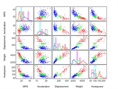
The points in each scatter plot are color-coded by the number of cylinders: blue for 4 cylinders, green for 6, and red for 8. There is also a handful of 5 cylinder cars, and rotary-engined cars are listed as having 3 cylinders. This array of plots makes it easy to pick out patterns in the relationships between pairs of variables. However, there may be important patterns in higher dimensions, and those are not easy to recognize in this plot.
Parallel Coordinates Plots
The scatter plot matrix only displays bivariate relationships. However, there are other alternatives that display all the variables together, allowing you to investigate higher-dimensional relationships among variables. The most straight-forward multivariate plot is the parallel coordinates plot. In this plot, the coordinate axes are all laid out horizontally, instead of using orthogonal axes as in the usual Cartesian graph. Each observation is represented in the plot as a series of connected line segments. For example, we can make a plot of all the cars with 4, 6, or 8 cylinders, and color observations by group.
Cyl468 = ismember(Cylinders,[4 6 8]);
parallelcoords(X(Cyl468,:), 'group',Cylinders(Cyl468), ...
               'standardize','on', 'labels',varNames)
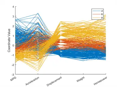
The horizontal direction in this plot represents the coordinate axes, and the vertical direction represents the data. Each observation consists of measurements on five variables, and each measurement is represented as the height at which the corresponding line crosses each coordinate axis. Because the five variables have widely different ranges, this plot was made with standardized values, where each variable has been standardized to have zero mean and unit variance. With the color coding, the graph shows, for example, that 8 cylinder cars typically have low values for MPG and acceleration, and high values for displacement, weight, and horsepower.
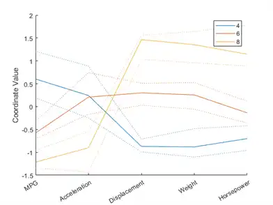
Even with color coding by group, a parallel coordinates plot with a large number of observations can be difficult to read. We can also make a parallel coordinates plot where only the median and quartiles (25% and 75% points) for each group are shown. This makes the typical differences and similarities among groups easier to distinguish. On the other hand, it may be the outliers for each group that are most interesting, and this plot does not show them at all.
parallelcoords(X(Cyl468,:), 'group',Cylinders(Cyl468), ...
               'standardize','on', 'labels',varNames, 'quantile',.25)
Andrews Plots
Another similar type of multivariate visualization is the Andrews plot. This plot represents each observation as a smooth function over the interval [0,1].
andrewsplot(X(Cyl468,:), 'group',Cylinders(Cyl468), 'standardize','on')
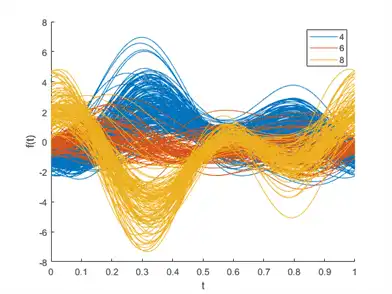
Each function is a Fourier series, with coefficients equal to the corresponding observation's values. In this example, the series has five terms: a constant, two sine terms with periods 1 and 1/2, and two similar cosine terms. Effects on the functions' shapes due to the three leading terms are the most apparent in an Andrews plot, so patterns in the first three variables tend to be the ones most easily recognized.
There's a distinct difference between groups at t = 0, indicating that the first variable, MPG, is one of the distinguishing features between 4, 6, and 8 cylinder cars. More interesting is the difference between the three groups at around t = 1/3. Plugging this value into the formula for the Andrews plot functions, we get a set of coefficients that define a linear combination of the variables that distinguishes between groups.
t1 = 1/3;
[1/sqrt(2) sin(2*pi*t1) cos(2*pi*t1) sin(4*pi*t1) cos(4*pi*t1)]
ans =

    0.7071    0.8660   -0.5000   -0.8660   -0.5000
From these coefficients, we can see that one way to distinguish 4 cylinder cars from 8 cylinder cars is that the former have higher values of MPG and acceleration, and lower values of displacement, horsepower, and particularly weight, while the latter have the opposite. That's the same conclusion we drew from the parallel coordinates plot.
Glyph Plots
Another way to visualize multivariate data is to use "glyphs" to represent the dimensions. The function glyphplot supports two types of glyphs: stars, and Chernoff faces. For example, here is a star plot of the first 9 models in the car data. Each spoke in a star represents one variable, and the spoke length is proportional to the value of that variable for that observation.
h = glyphplot(X(1:9,:), 'glyph','star', 'varLabels',varNames, 'obslabels',Model(1:9,:));
set(h(:,3),'FontSize',8);
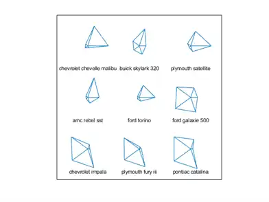
In a live MATLAB figure window, this plot would allow interactive exploration of the data values, using data cursors. For example, clicking on the right-hand point of the star for the Ford Torino would show that it has an MPG value of 17.
Glyph Plots and Multidimensional Scaling
Plotting stars on a grid, with no particular order, can lead to a figure that is confusing, because adjacent stars can end up quite different-looking. Thus, there may be no smooth pattern for the eye to catch. It's often useful to combine multidimensional scaling (MDS) with a glyph plot. To illustrate, we'll first select all cars from 1977, and use the zscore function to standardize each of the five variables to have zero mean and unit variance. Then we'll compute the Euclidean distances among those standardized observations as a measure of dissimilarity. This choice might be too simplistic in a real application, but serves here for purposes of illustration.
models77 = find((Model_Year==77));
dissimilarity = pdist(zscore(X(models77,:)));
Finally, we use mdscale to create a set of locations in two dimensions whose interpoint distances approximate the dissimilarities among the original high-dimensional data, and plot the glyphs using those locations. The distances in this 2D plot may only roughly reproduce the data, but for this type of plot, that's good enough.
Y = mdscale(dissimilarity,2);
glyphplot(X(models77,:), 'glyph','star', 'centers',Y, ...
          'varLabels',varNames, 'obslabels',Model(models77,:), 'radius',.5);
title('1977 Model Year');
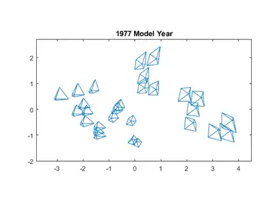
In this plot, we've used MDS as dimension reduction method, to create a 2D plot. Normally that would mean a loss of information, but by plotting the glyphs, we have incorporated all of the high-dimensional information in the data. The purpose of using MDS is to impose some regularity to the variation in the data, so that patterns among the glyphs are easier to see.
Just as with the previous plot, interactive exploration would be possible in a live figure window.
Another type of glyph is the Chernoff face. This glyph encodes the data values for each observation into facial features, such as the size of the face, the shape of the face, position of the eyes, etc.
glyphplot(X(models77,:), 'glyph','face', 'centers',Y, ...
          'varLabels',varNames, 'obslabels',Model(models77,:));
title('1977 Model Year');
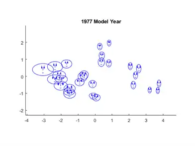
Here, the two most apparent features, face size and relative forehead/jaw size, encode MPG and acceleration, while the forehead and jaw shape encode displacement and weight. Width between eyes encodes horsepower. It's notable that there are few faces with wide foreheads and narrow jaws, or vice-versa, indicating positive linear correlation between the variables displacement and weight. That's also what we saw in the scatter plot matrix.
The correspondence of features to variables determines what relationships are easiest to see, and glyphplot allows the choice to be changed easily.
close